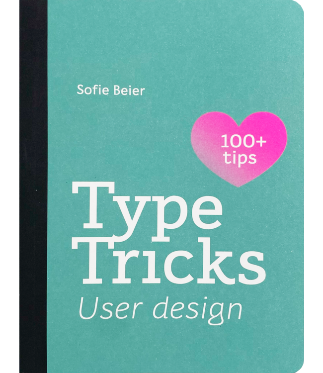
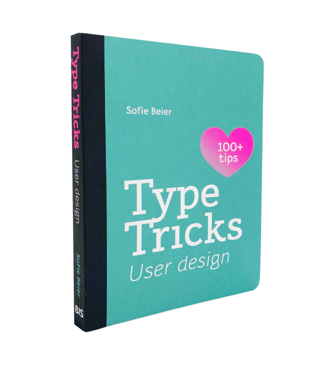
Type Tricks: User Design
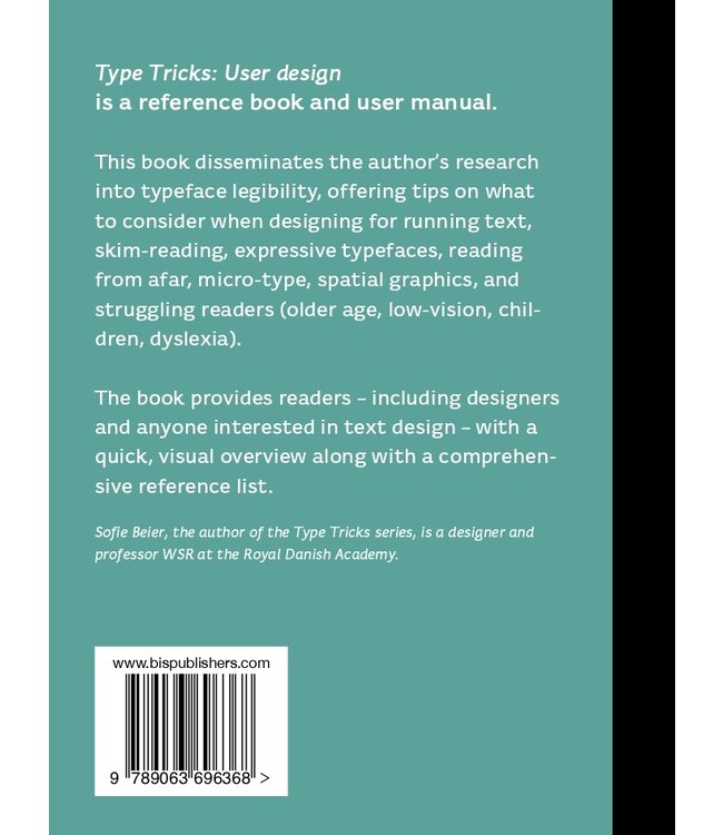
What to consider when choosing fonts in difficult reading situations including signage, small point sizes, glance-like reading or scanning? But also what to look out for when designing for struggling readers.
Free shipping within the Netherlands
On orders of 20 euros and moreFast global delivery
Next day in NL, 1-5 business days in Europe and US, other countries ASAP
Product description
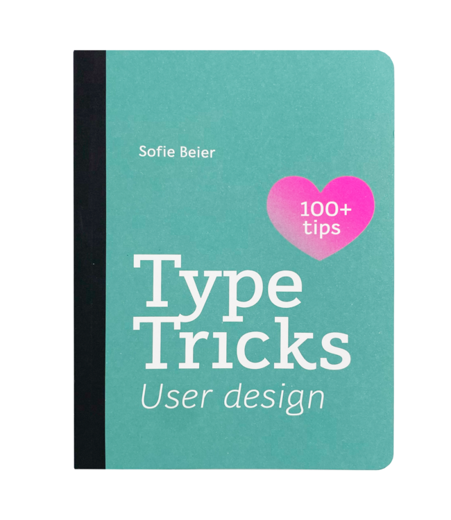
Type Tricks, the third book in the series, focusing on usability in typography and how different typefaces and letter shapes influence the way we read. Distilling advanced typographic knowledge into an accessible medium with beautiful illustration, the book acts as a small and handy guide for those looking to impart a certain message from their chosen text.
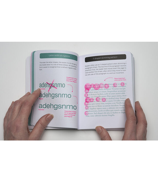
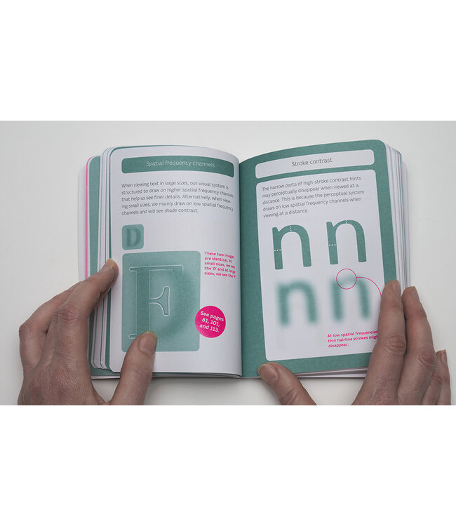
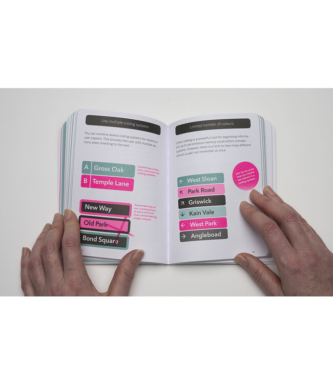
From beginners looking to learn more about typography to practitioners seeking an advanced level of knowledge without the need to read through extended research articles, Type Tricks will be your go-to book. Each double-page spread focuses on a range of intricate parts of typography, giving examples and illustrating them as to teach users through visual learning. As aesthetic as it is useful, this book is a fantastic gift for a design lover.
With 140 evidence-based tips that help the user excel in typographic design, this book is a must-have when designing for the modern reader.
Check Type Tricks and Type Tricks: Layout Design
Author
Sofie Beier is a professor at the Royal Danish Academy, where she is head of the research unit Centre for Visibility Design. In addition to creating the Type Tricks series, she published numerous academic papers on typeface legibility. Her research is focused on improving the reading experience by achieving a better understanding of how different typefaces and letter shapes can influence the way we read.
Reviews
Preview
Combi deals
Specifications
Type Tricks: User Design
0 reviewsReview Sofie Beier Type Tricks: User Design
What to consider when choosing fonts in difficult reading situations including signage, small point ..


